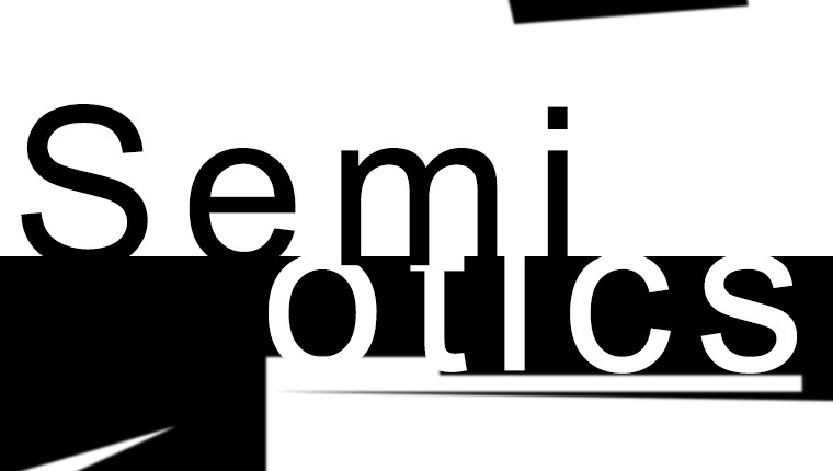
Trust me on this: next time there is a lull in the conversation, mention “Semiotics.” Be sure to use “juxtaposition,” “vernacular” and “context” peppered throughout the conversation. ‘POOF’ – you went to Art School and saved 100K.
One can focus their graduate studies on semiotics and linguistics, but let us suffice to say that semiotics is simply the theoretical study of what things mean in relation to other things. Semiotics provide a lens through which to define and decode vernacular (visual language). For example, everyone knows the FedEx logo, but have you ever noticed the joke? There is a figure/ground play within the EX combination: notice how the negative space between the E and the X creates an advancing arrow. Now that you have seen that, you will never be able to not see it. You’re welcome. Beyond the figure and ground play, what does that arrow mean, why is it there? These are the questions that one asks when interrogating something based on semiotics.

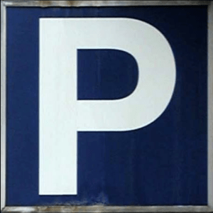
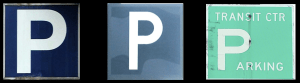
Another example of semiotics in the wild. These three parking signs are all within about a five-block area and serve the same basic function, but they communicate very differently and have different connotations. The first is good design: proportion, contrast, negative space…all great. Sure, the sign isn’t new which is evidenced by the rust and decay around the edges. This tells us about the agency of the sign. The existence of the rust is a sign of decay; it signifies that the sign has been in its location for doing its duty ostensibly for some time and has served its role well in that it hasn’t been replaced.
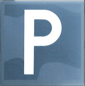
The second example is one that should make your eye twitch a bit because of its anemic design and poor contrast. You can almost hear the boss saying to their underling, “we need a parking sign; make something like the one down the street” – but, without a background in design or typography, the underlying naivety. Whereas the first sign uses a Helvetica Neue Bold, the second uses a face that lacks conviction and presence, and its proportions betray the difference between something that is designed and something that is made. This is a character that you wouldn’t want to hang out with at a party. To anthropomorphize a bit, if this P was in your friend group, this would be the guy that never picks up the tab for drinks. When you begin to look at the proportions of the negative space, the inconsistency between the top and bottom margin, one can only be left gobsmacked wondering what the creator was thinking.
Our third example is the result of “the city” getting in on the party and making their own parking sign; any time the local government gets involved in graphic design, you know everything is going to go to hell. Here you have a P where someone has grabbed its face and stretched it and then stuck “arking” beneath it.
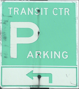
By juxtaposing these three examples of parking signs, an entire narrative can be decoded from their design to production and use.
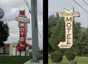
For our last examples of studying semiotics in the landscape, we will consider these two motel signs that, though having similar physical forms, communicate very differently. By juxtaposing the two motel signs, we can begin to decode their communication based on their individual and shared language (vernacular).
Because of their basic physicality, one would posit that they are both from a similar era but that’s where their common language ends. The one on the left, a little dog-eared and showing its age but overall, not a place that you would be afraid to stop at. This looks like the kind of place that Sal and Milly have been stopping at in their travels to Florida for the past 50 years. It projects a certain nostalgic charm. The sign on the right, however, screams, “…it doesn’t matter how low on gas you are, keep driving!” This is a place with damp carpeting and a chalk outline on the floor. Neither of these scenarios may be accurate, but this demonstrates how we internally understand and use semiotics in our lives. Our brains process information like this endlessly throughout our days. Evolutionarily we are hardwired to scan and decode our surroundings…can I eat that, will that eat me…?
Next time you are on a roadtrip with the family, play a game of trying to create a narrative based on the visual language of a thing or place, but then question what it was that drew you to those ideas. What was the sign (the thing), what was the signifier (what does that sign mean) and then what is the significance? Trust me, this is sure to be a hit with the kids and will be way more entertaining than the license plate game. And when the kids ask you how you came up with such a weird game, tell them you read about it on some artist/designer’s last Creative Pinellas blog post. It’s been fun, everyone. Thank you for reading my rants and ramblings. I’ve learned a lot about myself in the process and hope you’ve gotten at least a few takeaways and maybe a couple of smiles.
-d
www.beachaus.com
beachaus@me.com