In our Zoom meeting Friday night Gabriel, (my artist mentor) talked again about “The Passage of Time.” It’s making sense to me now why he was interested in my process of creating work.

You see, when I had described to him what I do, I said I weave in traditional techniques. And then described what I made. I didn’t say how long it took to complete a basket and had completely glossed over my physical participation in creating the object.
I took for granted the viewer would be interested in the result. And he, as the viewer, wanted to know how it was created. Then he suggested that I consider the importance of the element of (hand)work and the time it takes to do it.
So, how do we show time? Perhaps by the repetition of movements, visually show showing the steps involved in the process. Repetition by making a series of objects? Or by the size of the completed piece?
This concept of time, and showing its passage then, is important for my project. Especially since I’ve decided (if it works for the Creative Pinellas Gallery space), to show a glimpse of “41 Weeks” into the Lives of the Stehles during Covid-19 2020. A mouthful, huh?
I’m staying with the original title: 41 Weeks of Covid-19 Comfort with the subhead Food, Music and What We Needed to Get By.
And then, to make it more fun, I would do another related work or assemblage, a flip side, conveying emotions felt during this time. So, perhaps I am working backward? Is this Cause (the flat assemblage) and then Effect (41 Comfort Baskets)?
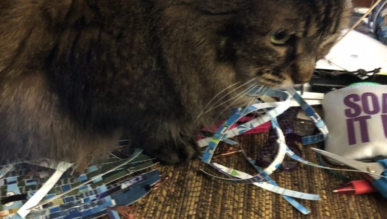
MY WEAVING PARTNER
A few cute kitty pictures
Our cat Squeaky likes to hang out with me when I’m weaving. She especially likes to claim anything I’m working on. Squeaky will plop herself down on anything on the floor. If it’s a true basket, she’ll sit in it…or think about how to get into it. If it’s flat, she will sleep on it until I shoo her off. I take things out of her mouth all the time!
41 Baskets: The Effect
I’ve been constructing the forms,. The rims are the strips of metal from hanging folders bent into a circle. The “frame” is woven from old round reed that easily dates back 10 years or more. I’ve cut thin cardboard boxes by hand into strips and shredded business rack cards and then randomly weave, usually in front of the TV or listening to music. In my mind, I’ve designated 20 baskets representing food, 11 baskets for #Songs of Comfort and 10 for oddball miscellaneous items.
Some will be embellished with beads, metal pull tabs, plastic bottle caps or brightly colored foil wine caps. They will “float” in the air, hung or strung on long lengths of fishing line. There will be an element of audience participation, but I’ll talk about that much later next year! Gabriel and I agree I should map out the installation so I will attempt to draw (I don’t draw, don’t paint!) a schematic layout to scale. Reminder to self: Need info about the exhibit space, height of room, etc.
THE CAUSE
A Triptych of Emotion
Gabriel’s idea of creating “out of the basket” translates to me as a flat, well, mostly flat hanging piece. So, I’m thinking of three pieces (all taller than five feet) suspended from the ceiling. Not hung on a wall. And I’m thinking of color: Express emotion by use of color.
As a typical basketmaker, I consider form. I choose my weaving supplies and color at the same time. As a sculptor and flat weaver, the color of my paper, my “supplies” is of the utmost importance, like paint is to a painter.
Do you remember the book, The Luscher Color Test? For some reason, I purchased the soft cover book in 1971 and was intrigued by the analysis of color. Seems kind of “hippie-dippy” but some of the theory stayed with me.
The color test was invented by Dr. Max Luscher in Basel, Switzerland, who believed that sensory perception of color is objective and universally shared by all. However, he thought color preferences are subjective and could be objectively measured by using test colors.
Personality traits, he believer, could be identified based on one’s choice of color; those who select identical color combinations have similar personalities.
TAKE THE LUSCHER COLOR TEST
When Gabriel and I spoke about working flat and conveying emotion, the Luscher Color Test immediately came to mind. I can’t find that book (probably stashed away safely in a box in a closet) but through the power of the internet, easily accessed the test.
Luscher conducted a test of eight different colored cards and asked subjects to place them in order of preference. And all the explanations in current terms. From Wikipedia:
Colors Meanings[1][2]
Blue “Depth of Feeling” passive, concentric, tranquility, calm, tenderness
Green “Elasticity of Will” passive, concentric, defensive, persistence, self-esteem/assertion, pride, control
Red “Force of Will” ex-centric, active aggressive, competitive, action, desire, excitement, sexuality
Yellow “Spontaneity” ex-centric, active, projective, aspiring, expectancy, exhilaration
Violet “Identification” unrealistic/ wishful fulfillment, charm, enchantment
Brown Bodily senses, indicates the body’s condition
Black Nothingness, renunciation, surrender or relinquishment
Grey Non-involvement and concealment
You can take the Luscher Color Test and receive via email a printed copy of your personality analysis: https://onlinetestpad.com/en/test/987-the-luscher-color-test
Over the years, Luscher’s test has been discredited by scientists, although some maintain it is highly accurate as a non-verbal test, especially in children.
Funny. I forgot what colors I chose in order of preference almost 50 years ago but I know they were different! But back to color and emotional impact…
YIKES! TALKING AND WRITING TOO MUCH
I’ve lost track of time and already this blog post is close to 1,000 words. So let’s take a break.
It will give me more time to study color (yep, an assignment from Gabriel) and see how other artists, such as Mark Rothko, use color almost exclusively in their work. Read more cool things online. Have fun with the research.
See you here in a few days!