Reflecting
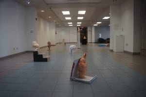
Since I’ve been thinking a lot about finishing up sculptures lately, I remembered that my solo show at HCC, Dale Mabry opened almost two years ago. I’ve been thinking about that work: what I want to keep up with in future work and what I think I’ve outgrown, although that sounds a little too mature. What sticks out the most to me as a future problem is the 1:1 ratio between handmade sculpture and found object. There’s always an organic, peristaltic form on top of an object, usually very rigid and geometric (i.e. a square pizza box, crisp cylindrical paper towels, furry staircases). While funny and I think a flattering parody of Minimalism and the history of display, it might read a little heavy handed when almost every sculpture works like that. Or if not heavy handed, just a little boring and repetitive. Like a joke repeated at a party three or four times. Maybe not that bad, actually, but not ideal.
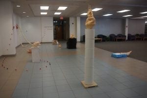
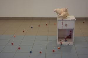
I tried to even out that 1:1 ratio by playing with 1) the heights of some sculptures and 2) the general display of others. Teenage Talk on the right, for example, is fundamentally a pretty traditional sculpture display: a sculpture on top of a pedestal, here with a nightstand being the simulacrum of a pedestal. The lollipops sashaying out of the nightstand, however, make the piece feel more integrated with the environment around it, which slightly blurs where the total sculpture begins and ends. It’s not just a sculpture on top of a display, and the sculpture and the display really are not as separate from each other or the room as much as some sculptures normally are. Parts of this sculpture you can walk over or through instead of just around. Some sculptures incorporated other objects but were only slightly analogous to sculptures, like the puppy pads on my worm piece, Strobila 1, or the baby pen in Bloomers. My first wall sculpture was made because I was scared of all the empty wall space with the filled hallway of sculptures.

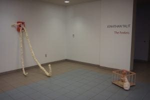
The exhibition space at HCC, Dale Mabry was basically a glorified hallway (which I’m happy they glorified) that was completely open. It was connected to a library and several office spaces so there was a lot of through-traffic. It made for a really unique viewing experience (I really got off on the idea of people doing homework or writing papers with my sculptures lurking behind them). However, the porous quality of the room really let a lot of air in that made my work feel much smaller, a little less focused, and too general (lots of surface details get missed). Going forward, I’d like to see how I can really command a tighter room with more low, freestanding sculptures. I’d also like to be more “democratic” with the makeup of these sculptures. As of yet they’ve been mostly clay. What if they could be equal parts clay and spray foam? Equal parts inside and outside? Equal parts handmade and found objects? Equal parts open and closed? I won’t have time to totally equalize that for the exhibition in September, but it is something I think about a lot and hope to at least be considerably closer to than I was two years ago.
