You know the old adage about how your kids are supposed to rebel against their parents? I was really hoping that that was going to be my kid and they were going to want to be a contractor, a doctor or a programmer… but no, they gravitated to the arts. Sigh. Aside from the ulcer-inducing anxiety that comes with being a parent of a student pursuing a career in the arts, at least having spent my career in the arts, I am able to offer relevant or even sage advice and direction whether or not it is asked for or utilized. As they have gotten older and matured in their own artistic selves, more and more I am able to share my own processes and thinking behind my work. After creating the cover art for my last blog entry, I created a series of screenshots so that I could show Indi (my kid) how the piece evolved and how I moved through the thought process. Being a purveyor of the pragmatic and meta, I decided to share that process here…an art blog talking about creating art for a blog, come on, how meta is that? And pragmatic too:)
In the beginning there was void and it was good
I once greeted my incoming design students with a banner that went all the way around the studio on which was repeated over and over, “Do No Harm.” A blank canvas is pure and unspoiled. Is what you are about to do going to make it better? This takes Ludwig Mies van der Rohe’s axiom, “less is more” to an extreme but it is true. As you move into that clean blank canvas, are you making things better or are you making them worse? I think that the best way to approach a blank canvas is as a kind of meditation; it is a time where one should exhale and relax before breaking ground. I wrote in my last blog entry about starting a project by looking at the internal geometry of the canvas itself, which to me is a kind of meditation. In this case that meditation is a little more pragmatic than spiritual, but a meditation nonetheless.
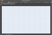
Looking at that empty 760×430 area as I get ready to begin, I start with the absolutes: I know that the title of the blog is, “Ah-ha” and I know that the destination is a white web page where art will accompany copy.
You think you are funnier than you are and first ideas always sucks.
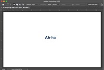
Gotta start somewhere and I thought this was funny for a few art geek reasons but mostly because I thought it would be funny to make Paula’s (the person who reviews our blogs for Creative Pinellas) eye twitch by just floating a bit of text where an image is expected. But then I thought that I would be nice and at least make it clear that I had, in fact, uploaded a proper image.
…ok then, enough mucking about.
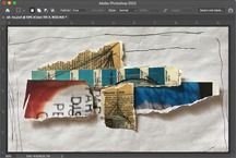
One of the places that I will go to when I am looking for ideas is the trash bin beside my desk. Without a clear vision of where I was going or how I was going to get there, I started with what I know best, working with my hands…taking random bits of paper that caught my eye, laying them out in my sketchbook, grabbing a pic with my phone, and then bringing the image into Photoshop.
Nobody wants to see your hickeys

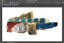
The first job, once I had the image in Photoshop, was to clean it up by dropping out the schmutz of the background and allowing the image to pop against a nice white background.
Well that’s not going to work…
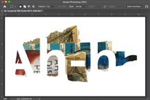
To quote Paul Rand (not to be confused with Rand Paul), “…when form dominates the content, meaning is blunted. When the content dominates the form, the form is boring.” If you look at the placement of the “Ah-ha” in the image above, it is there, you can see it, you can read it but, the type is being overpowered by the collage; the viewer is being told that the bits of paper are more important to the communication than the text; the content is being overpowered by the form.
Type loves to contrast organic textures.
Abstraction and figure ground play are recurring motifs in my work and, as a designer I am always looking for those holy grail gestalt moments. These are moments when the form and the content so complement each other; when text and image integrate together to look as though there is no other way they could have existed.
Remember the raisins?
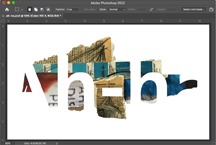
There isn’t a big alteration from the previous image; just the removal of the red counter space of the capital A on the left. Notice how differently the two compositions balance. If I had gone with the previous version, no one would have ever given it a thought, but that is my chocolate covered raisin.
Last but not least…
There you have the nickel tour of how I approach creative problem-solving. In the next blog I am going to be continuing my metafest by blogging about blogging.
-d