Experimenting w/ Monotype Texture
After spending a full weekend devoted to pulling single plate prints from my etchings, I decided to try and experiment with texture and color. In keeping with my goals for this grant, I wanted to try something different by being more experimental in my approach to these processes.
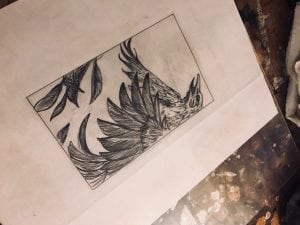
Typically my prints, relief and intaglio, are black and white. I don’t have a particular disdain for color, I’ve just never had a good enough reason to incorporate it. My prints are particularly illustratively and it’s always been my intent to keep them stark and dramatic by exploiting the positive and negative areas of my narratives. I think it was four years ago, during my sophomore year of college, I was sitting in an artist talk. A painter, I can’t recall his name, said something along the lines of “Color should only be used when it serves a purpose. Color has meaning–using it without intent is counterproductive.” This resonated with me.
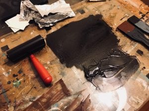
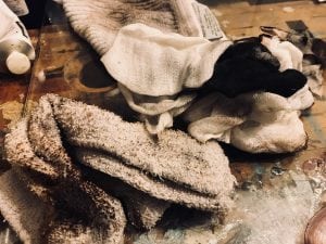
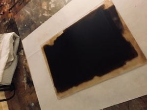
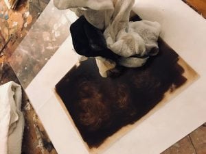
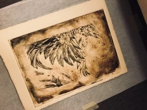
This past year i’ve slowly incorporated color into my intaglio prints using watercolor. Lately i’m become increasing more interested in combining various printmaking processes to achieve color. Below are images of my process in adding color to plexi-etching prints using monotype plate textures. Monotype meaning, a single print taken from a design created in ink on a plate.