Designing For Contrast
Over the years, one thing has remained consistent among ceramic artists who specialize in crystalline glaze – simple, smooth, clean forms make the best backdrops for glazing. For the most part, I am in agreement with my peers. Learning to make beautiful crystals – I mean REALLY learning to have some control – only comes after significant trial and error. The last thing we want to do is create a piece the competes with our beloved crystals. No, no, no…. That just won’t do!
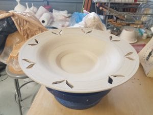
This is where continuing out of the comfort zone comes in handy. I am approaching this project from multiple directions and, with any luck, both approaches with result in work that complements the crystalline. As with all of my work, fluidity is essential. If I can’t keep the viewers eye moving around the piece, I will fail at evoking emotion. I need to create contrast without competition. I’m going to do this by creating cutouts in the piece and then filling the void. And with that, we have new challenges. Many of these challenges will be covered in future blog entries.
One thing that all potters know is that every time we touch a piece, we have a chance to ruin it. Cutting into it with a sharp knife increases that risk exponentially. That is what makes this part SO much fun. Once I jump in there, turning back is not an option. This will be the design that helps me to create fluid contrast. At least that’s the plan…