November 11, 2020 | By Steven Kenny
MFA Galleries Transformed
. . .
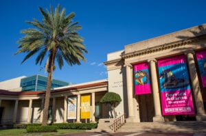
Sadly, a bad cold kept me from attending the first press walkthrough of St. Petersburg’s Museum of Fine Arts’ newly renovated galleries. Then, like a miracle, Lashonda Curry, Manager of Communications and Public Relations, reached out to offer another opportunity and I jumped at it! Adding to my good fortune, I had Lashonda and Dr. Stanton Thomas, Senior Curator of Collections and Exhibitions, all to myself as we toured the updated rooms.
Unlike many of the articles already published, I will focus primarily on what museum goers are often not consciously unaware of – the museum space.
Yes, a museum’s main objective is to draw attention to the works on display but that success or failure depends on how well the rooms housing those objects are designed. What the MFA’s new galleries brilliantly achieve is the creation of sensual atmospheres that help you feel the art you’re seeing.
. . .
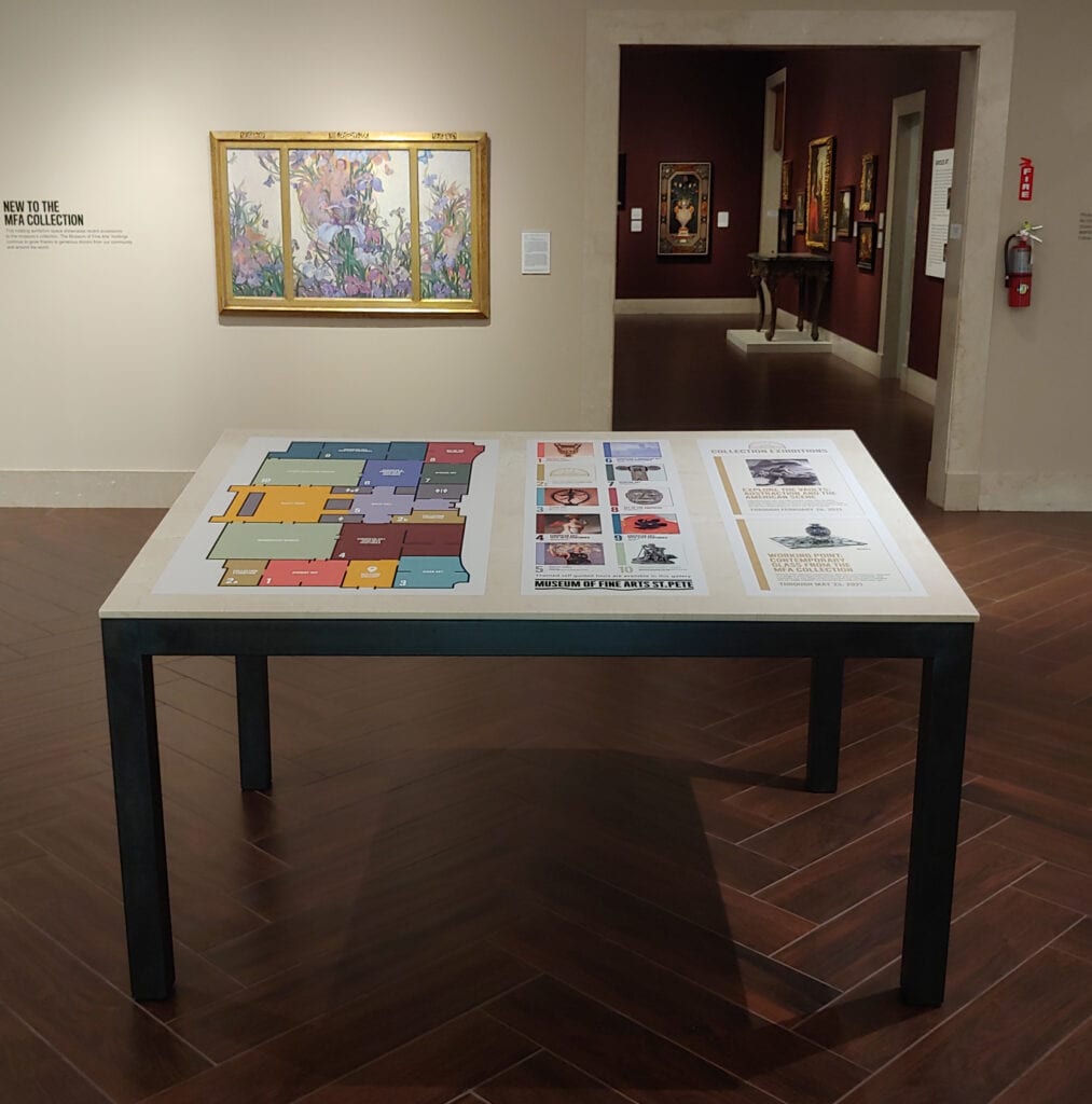
Before getting to the good stuff, visitors first enter the Welcome Gallery. It has all the information one needs to explore with confidence – floorplan, history of the museum and a timeline of art history – each presented succinctly, without overwhelming you with unnecessary details.
An added bonus are nine self-guided tour brochures which, in reality, are educational scavenger hunts for adults. These handy treasure maps are à la carte menus for the delicious visual smorgasbord that awaits. But wait! There’s more. Each folds out into a stunning frame-worthy reproduction of one of the artworks you’ll encounter.
. . .
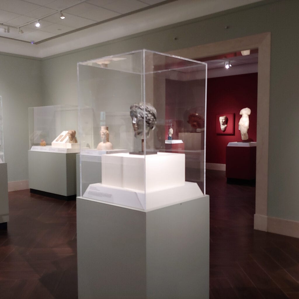
On the left we enter the Ancient Art offerings. Cool green walls offset selections from the sublime ancient Greek and Roman collection. The mood is chilly, but so would be the stone and bronze artifacts if we could touch or hold them. The clinical environment helps us examine the intricate works with a jeweler’s eye.
. . .
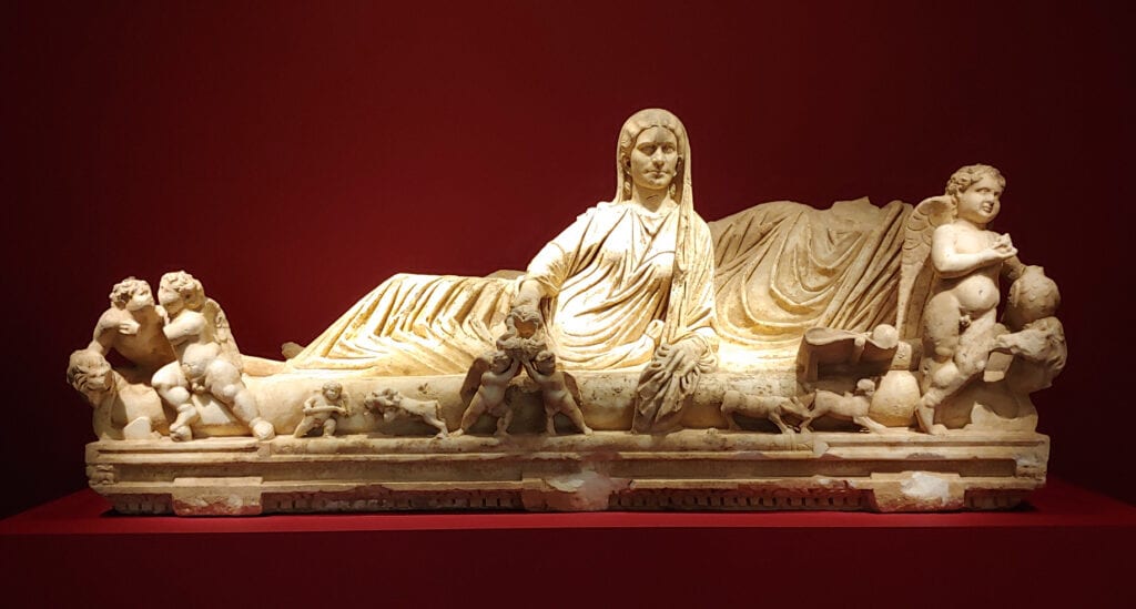
We’re then lured into the adjacent room by its seductive deep red glow – all the better to show off the white marble statuary. My immediate impression was that of the meat and bone of an elegant abattoir. Sculptors are butchers in a certain sense. This room reminds us that cool-to-the-touch figurative stone carvings are actually depictions of warm skin, soft flowing fabrics, rippling muscle and taught sinew.
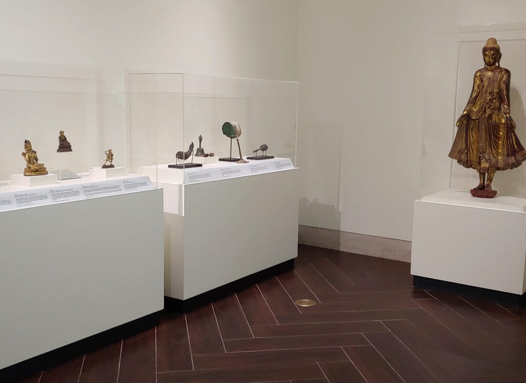
On the right side of the Welcome Gallery we find the Asian Art. Off-white walls direct our focus to the displayed artwork. This could be a sanctuary and we’re not to be distracted by peripheral, profane seductions. The spirits want our attention bent toward them, not superfluous decor.
Leaving there and turning right our senses are struck by several things at once. First, the space suddenly feels expansive. It’s as if we’ve been transported to one of the grand, stately museums of Europe.
Second, there is a new, unobstructed view straight to the other end of the building which only adds to the sensation of luxurious spaciousness. Third, there’s music! Thanks to our own Florida Orchestra the music changes to suit the art shown as we move through one historical period to another. Brilliant.
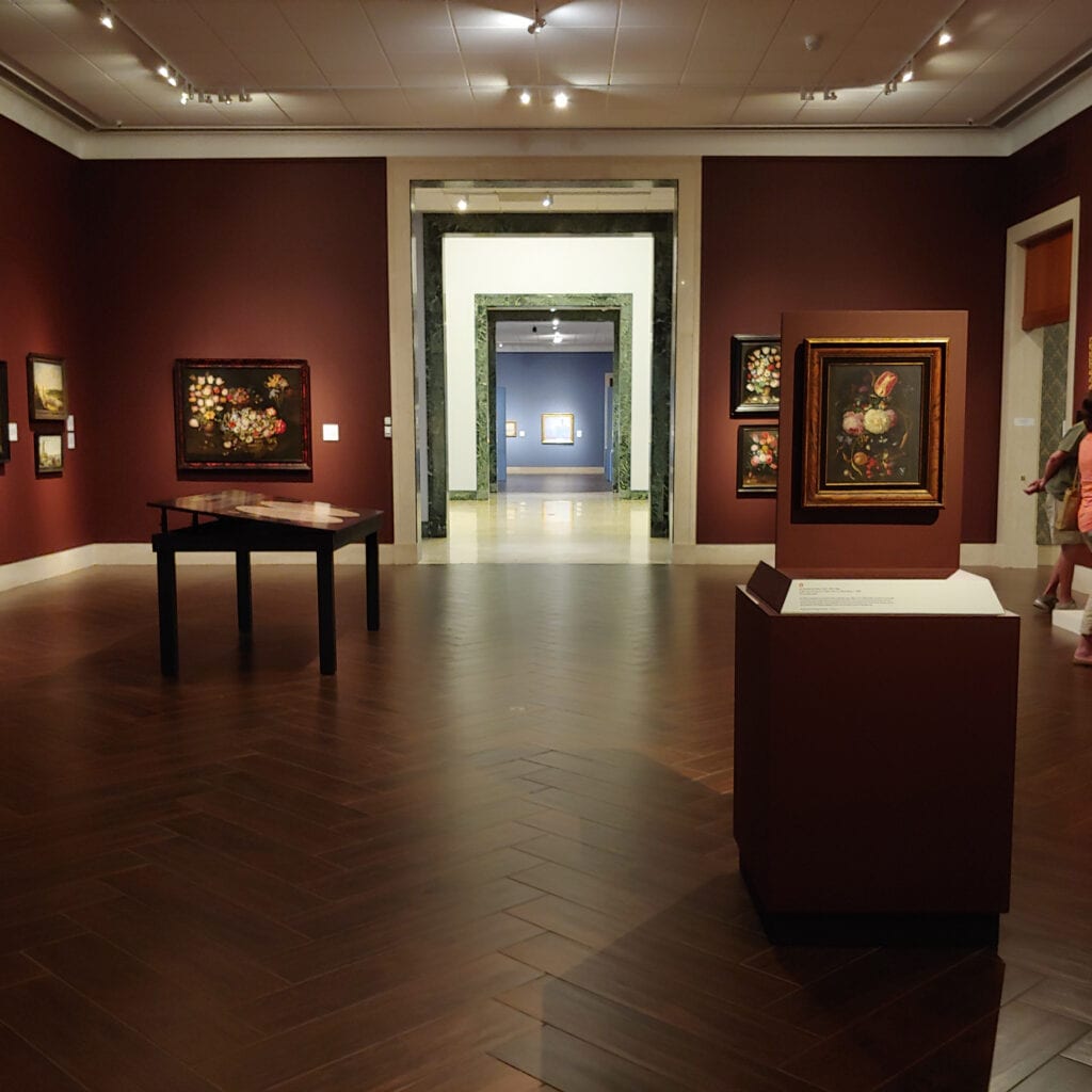
We enter the seemingly cavernous Baroque room. According to the museum, the walls are painted in Rookwood Dark Red which perfectly complements the lustrous (faux) wood plank flooring. The paintings feel right at home and so do we in a warm environment reminiscent of the inner sanctum of an opulent palazzo or villa.
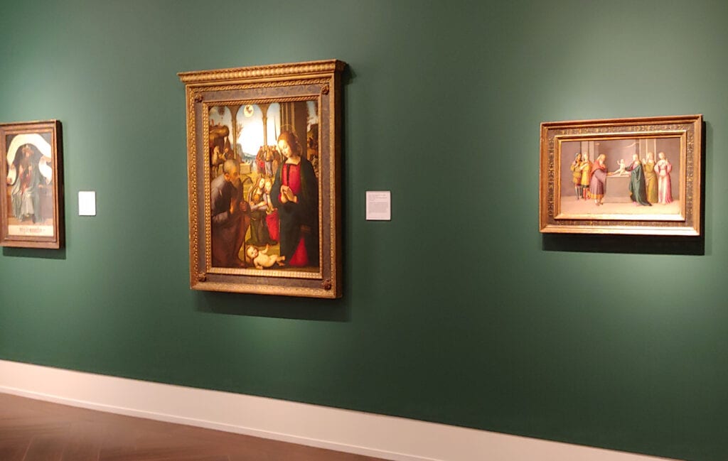
Through openings on the right we encounter a subdued, intimate chamber displaying exquisite works from the Medieval and Renaissance periods. The small room, painted a color called Hunter Club, suits the scrupulous detail seen in these meticulous works. It’s cozy and studious.
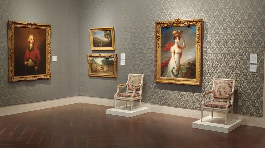
Next to that is the 18th Century European collection. We’ve now passed from gentleman’s club to cheery salon lined with understated, yet voluptuous, damask textile wall coverings. We stand a little straighter and step more lightly as we consider the objets d’art in this room.
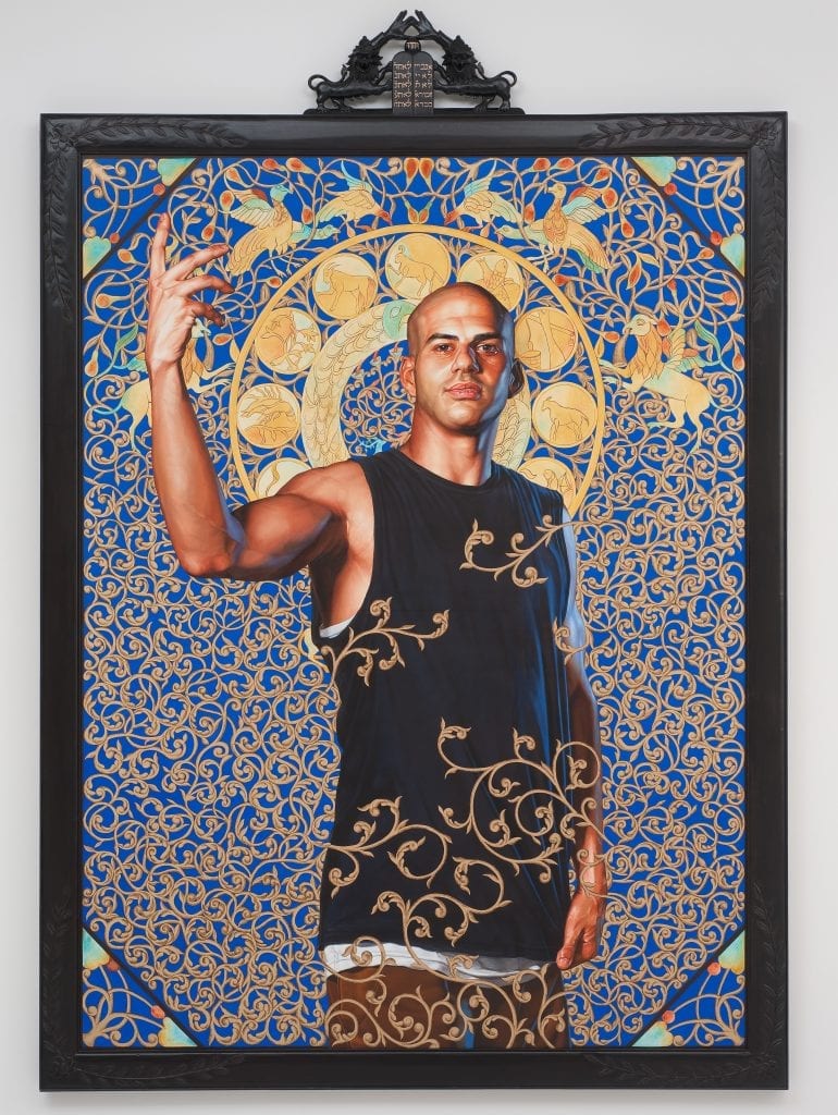
Leaving there we enter the Great Hall. It’s capacious, bright and empty except for two enormous 18th Century ornate gilt mirrors hanging high on the right which reflect the towering painted portrait by Kehinde Wiley on the left. Wait a minute! We suddenly feel very small due to the abrupt change in scale. Did we somehow sip a bit of Alice’s ‘Drink Me’ shrinking potion?
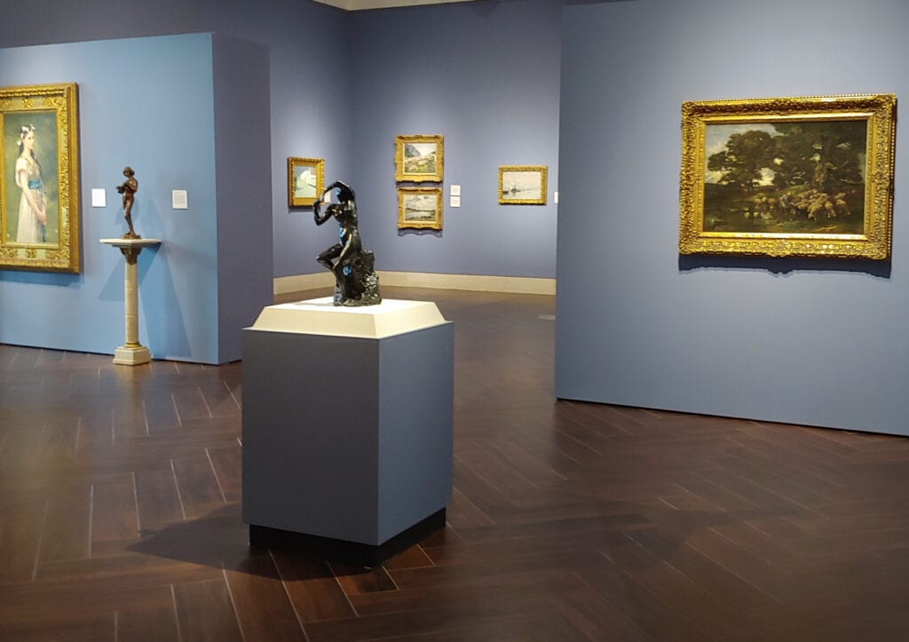
We return to normal size when we enter the European and American Art of the 19th and 20th Centuries gallery. Calming Wedgewood-blue walls set off landscapes and portraits by some of the best artists of the day working on both sides of the Atlantic. This room brings the outdoors inside. It’s fresh, restful and airy.
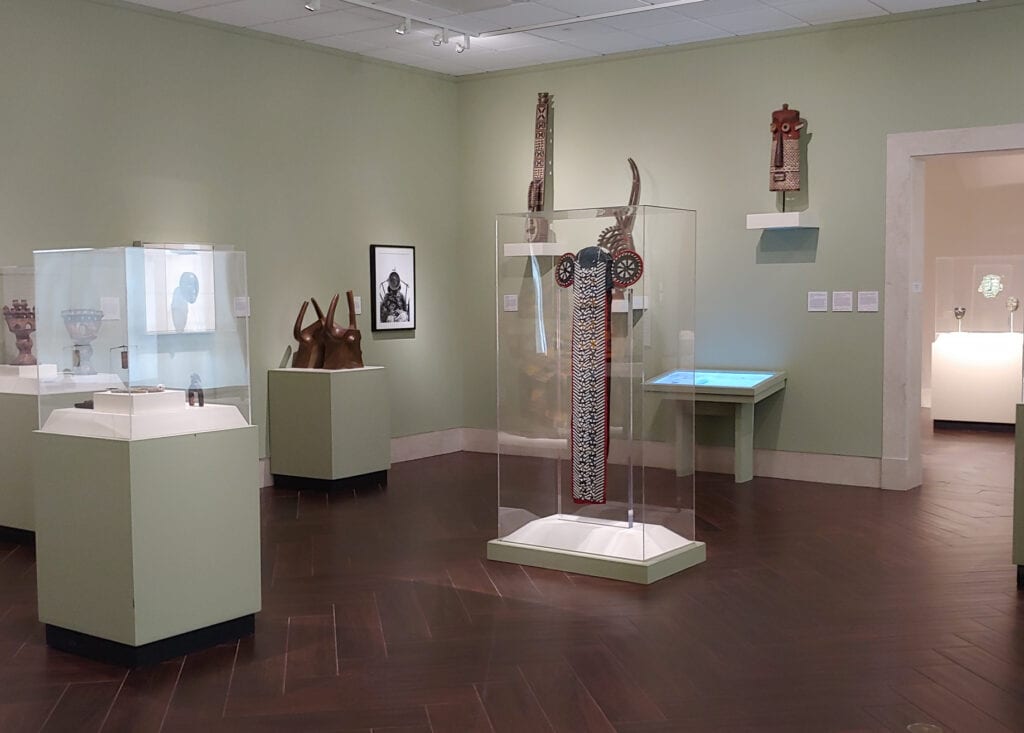
That impression continues in the room to the right but we’re transported to the African continent. Walls of sage green – a color called Koi Pond – reminds us that Africa is all things: a verdant jungle paradise, vast grasslands, as well as limitless desert. The life Africa has to offer is here.
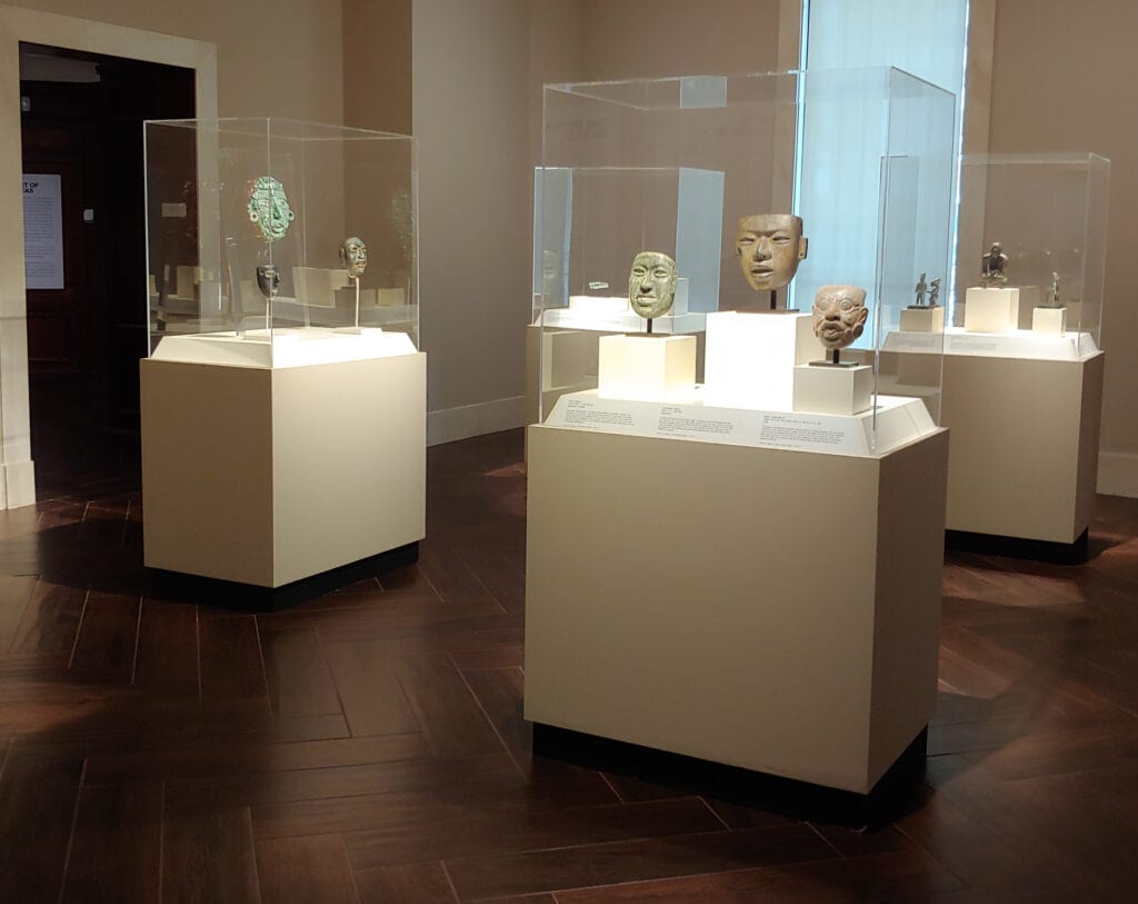
The rooms dedicated to Art of the Americas have a similar feel, yet unique. One understands a connection to the Earth that is a common thread. The pieces themselves are unified in ways that create a resonant web that we enter into.
From there, more culture shock as we walk into the American 19th Century collection. The tipoff is the Tiffany lamp as we enter, giving the room a homey, familiar accent. A pastoral, colloquial respite before moving to the next room.
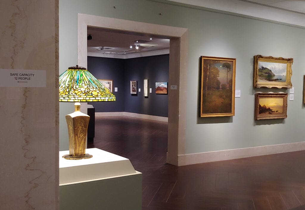
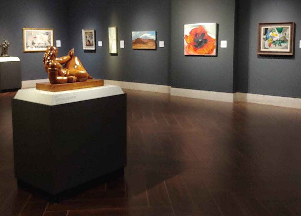
Gun metal gray walls fast-forward us into the 20th Century. The paint color is appropriately called Cyber Space. The paintings seem to float as the walls recede like constellations against a night sky.
Likewise, sculptures levitate above plinths of the same dark hue. Unlike all the previous galleries, this territory feels unfamiliar. The strong wall color unifies these willfully divergent creations.
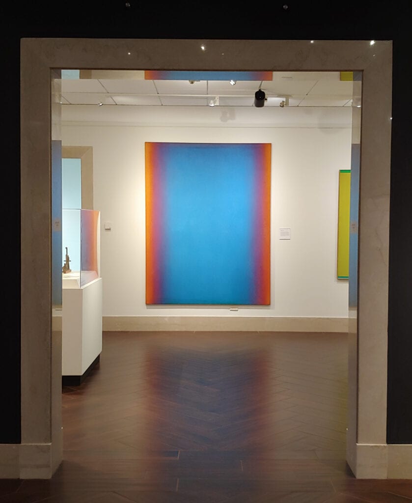
At the far end of this subdued gallery is a shining, glowing portal. So far we have been traveling on a chronological path through past centuries and now reach the brightly lit near-present. Left behind are recognizable images. The walls here are stark white so as not to detract from the color, line and form of the abstract works displayed.
The painting directly in front of us as we enter is Leon Berkowitz’s Big Blue. Our tour of the permanent collection ends in this room. In a way, however, this painting serves as yet another doorway. If we could step through it we’d surely find ourselves in the future – but the art of that time has yet to be created.
Go see the new galleries! The Museum of Fine Arts has done a magnificent job in creating an entirely new way to experience the Permanent Collection. Topping it off, there are over 100 never-before-displayed works of art to enjoy.
photos by Steven Kenny
Find out more at mfastpete.org
Explore highlights from the MFA’s collection online
at mfastpete.org/mfa-collection


