By Carol Mickett
. . .
My Visit
. . .
Through October 30
The Dalí Museum
Details here
. . .
I knew as soon as I walked into The Visit, the first solo museum exhibition in the U.S. by Uruguayan-Spanish artist Yamandú Canosa, that I was not in the typical Museum show.
When I go to an art exhibition, what I expect – and I believe others do as well – is to move from painting to painting or even to a sculpture. I look at the individual work, perhaps read the label, make some observations and some judgements. Then I move onto the next piece. The length of time I spend on each item depends upon the object itself and me.
This is not the case with The Visit. Or should I say – this absolutely was not the case for me.
I must confess that I did not look at all the individual pieces in Canosa’s installation because that is not what interested me during my visit. (I promise that I shall go back to the Dalí and look at each piece.)
. . .
. . .
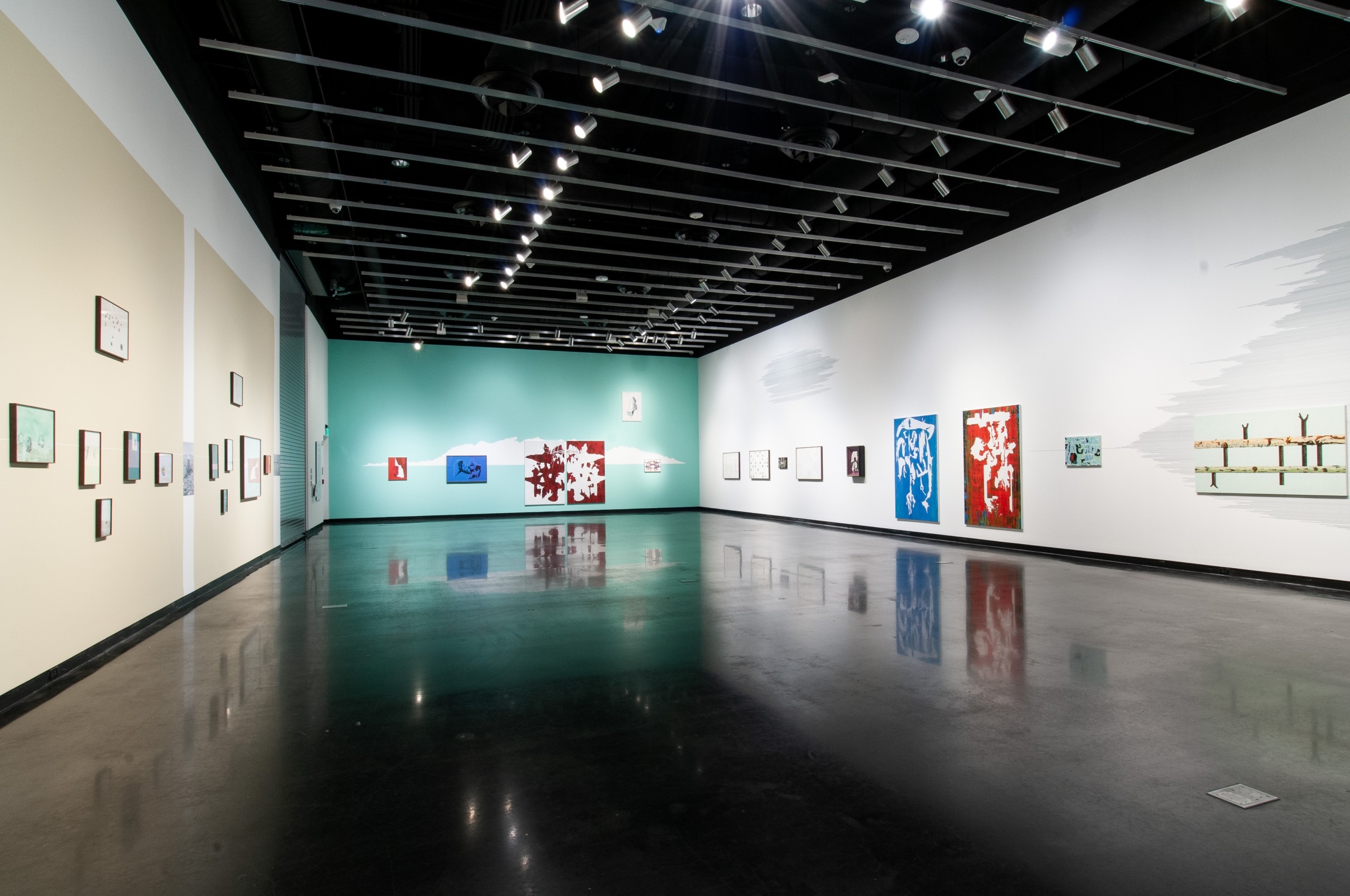
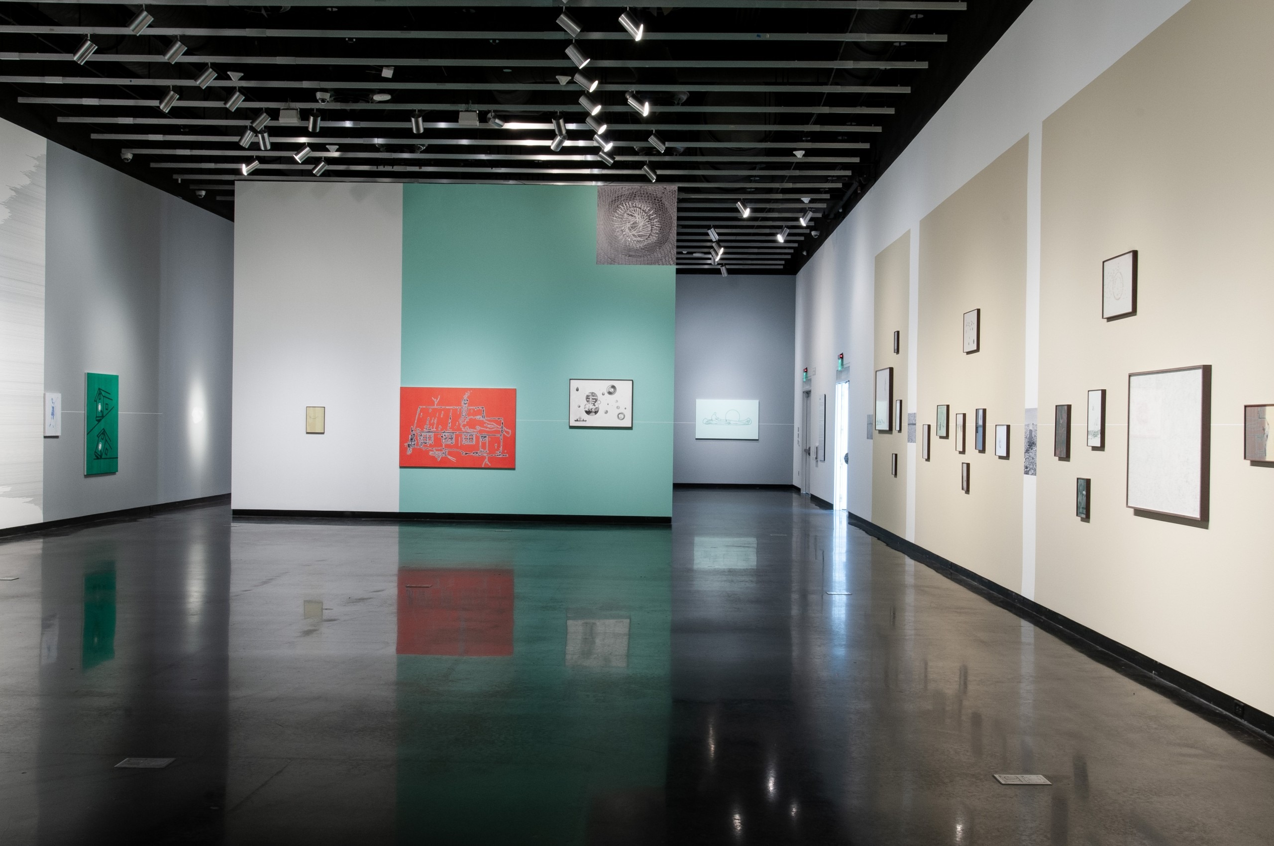
What interested me and what captured me immediately as I entered the gallery was that Canosa had created a unified place using coordinated colors and shapes. He hung the show creating an explicit and implied horizon line that served to unify the space. The lights in the gallery were up full which opened the space, instead of having lights focused on individual drawings and painting on the walls. Everything was done intentionally with a thought to how everything was related to create a whole.
I have been in these special exhibition galleries at the Dalí many times, but Yamandú Canosa was able to transform a large, challenging space into an intimate, welcoming home or artist studio.
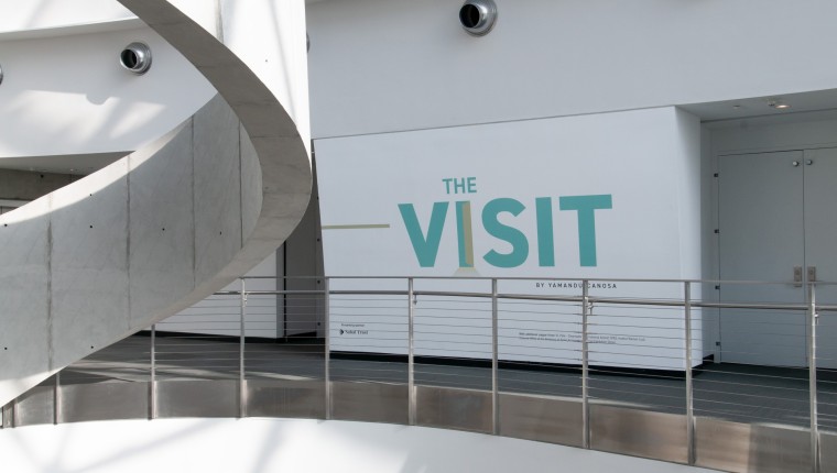
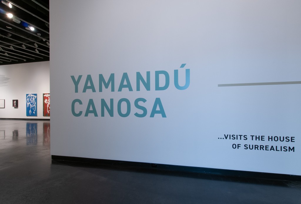
So, how did he accomplish this? Color. Canosa uses a certain light green that gets repeated throughout the show, upon which paintings and drawings hang. This green is first encountered outside the gallery in the show’s title and then in Canosa’s name, which is large and displayed as you first walk into the gallery.
. . .
. . .
Facing the wall with his name and turning your head to the right is a painting in this same green.
On the far opposite wall in the main gallery, the wall is entirely this color.
. . .
. . .
From this green wall in the main gallery, if you turn back toward the entrance, the painting is a wall-size, vertical rectangle of this same color.
. . .
. . .
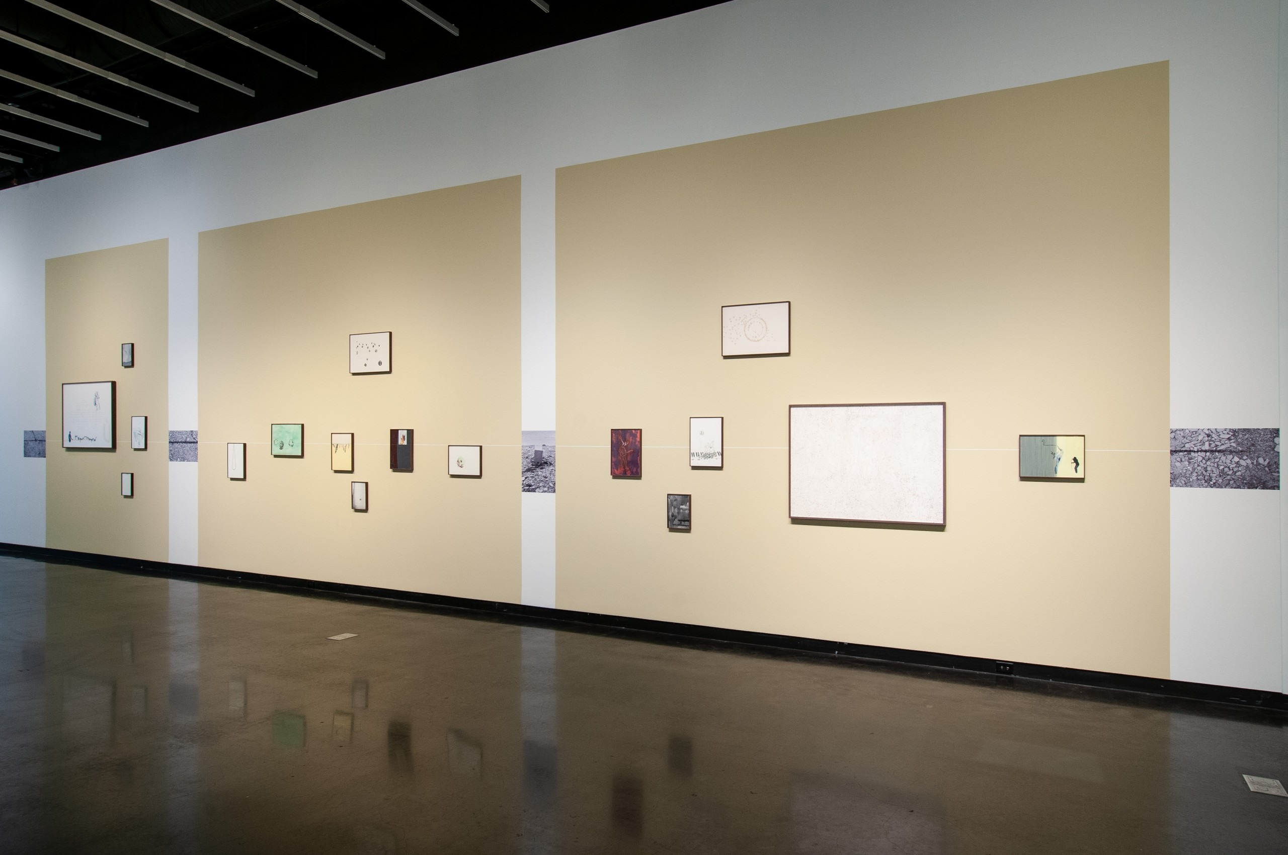
The rectangular shape, as you can see already, is color’s partner. The main gallery, in addition to the green rectangles, has a number of repeating beige, wall-size rectangles. And not to be forgotten is the rectangle of the full-length, elevator door that is, I am sure, the bane of every curator who works in this gallery. Here, however, it becomes a contributor to Canosa’s installation.
. . .
. . .
I would be remiss not to mention the unifying contribution of the scattering of red rectangles of larger paintings hung intermittently throughout the installation.
But nothing unifies the show as that particular green and the rectangular shapes. What a lesson in the power of color and shape!
. . .
I must not forget to acknowledge the horizon line that runs through the galleries both explicit and implied (e.g., the cloud on the green wall). It is like a ribbon that ties up a gift. Here the ribbon is simple with no flourish of a bow. But it does the work of tying the show together by keeping the eye moving to gather the space.
I was so taken by how Canosa unified the galleries. What was on the walls to me was intriguing but secondary except for the painting that participated in the green/rectangle unification.
. . .
. . .
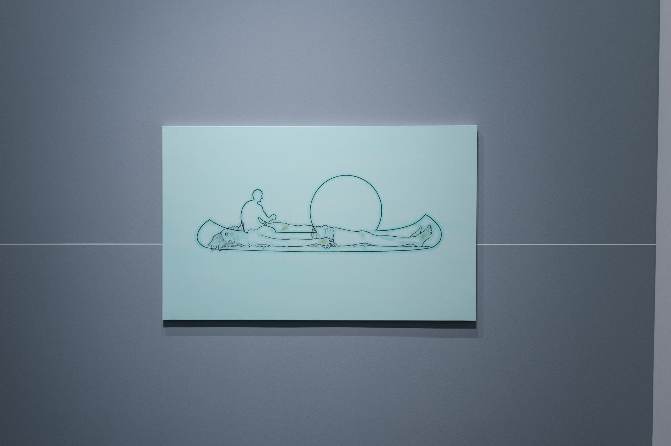
This is a simple and powerful painting. Its source is a painting by Hans Holbein, the Younger, The Body of the Dead Christ in the Tomb (1521).
What we see in Canosa’s painting is the body of Christ in the bottom of a canoe being paddled either under a full Moon or a setting Sun. Perhaps the paddler is Charon delivering the body to Hades, or Canosa simply likes the horizontality of both the body and the canoe. In any event, there is a merging of art history with the contemporary which is a clear theme in Canosa’s work.
Another reason I mention this painting is that it points out an important aspect of Yamandú Canosa’s process. He uses sources as his jumping-off point for making at least some of his work. This is a common way that artists proceed. My art collaborator, Robert Stackhouse, has a proclivity to this kind of process.
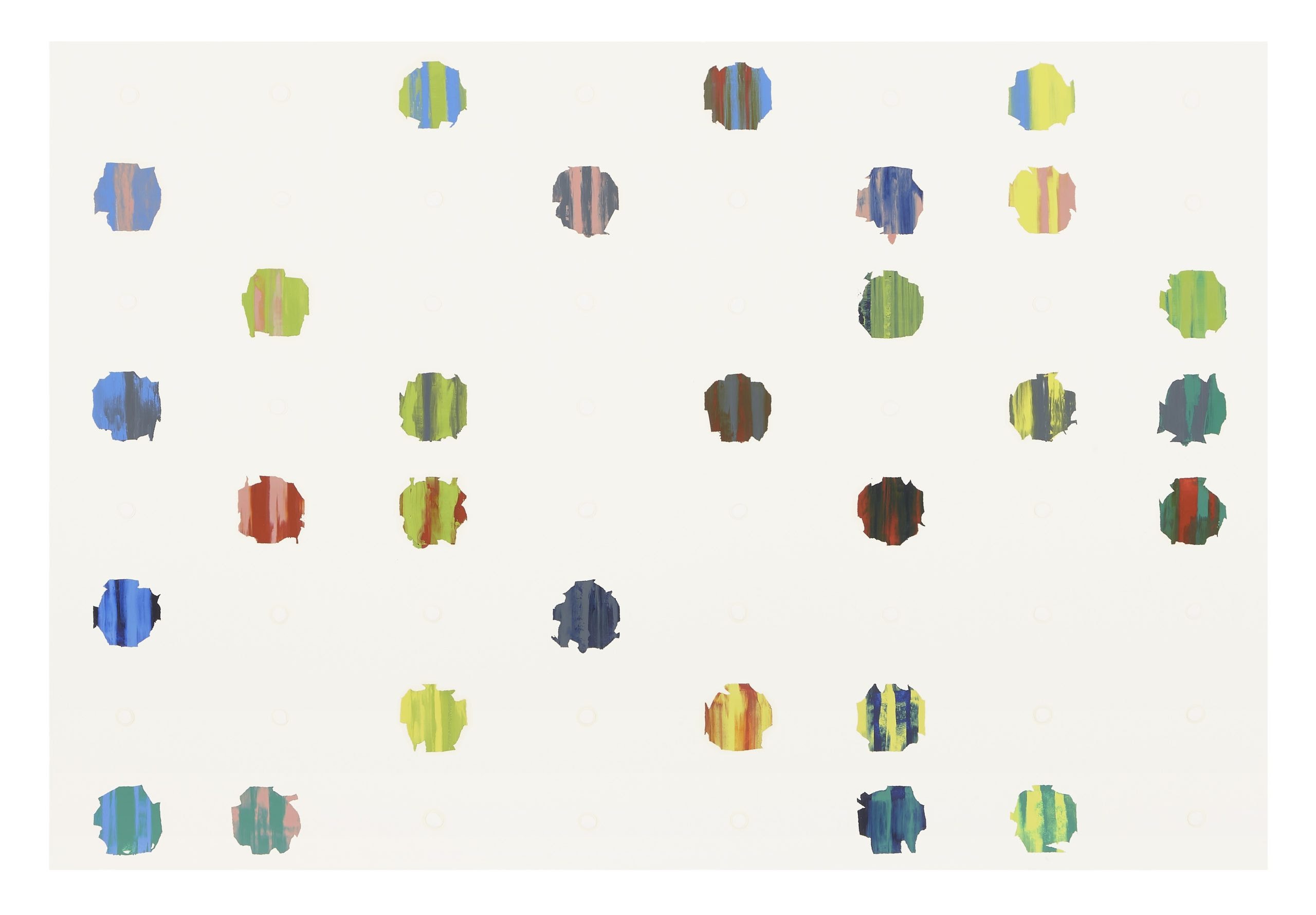
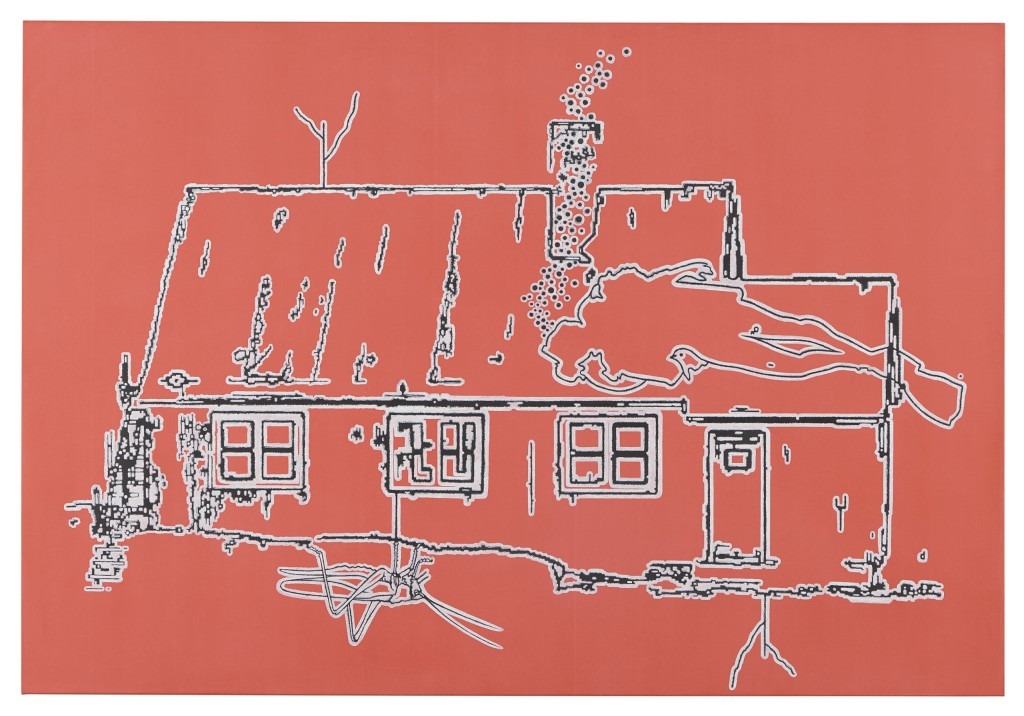
The entire show itself is generated from a source, namely, Canosa’s visit to the home of Salvador Dalí in the Bay of Port Lligat, Spain. Canosa uses the home of Dalí and its landscape to construct a place of his own that pays homage to his visit and to his roots in Spanish art history and surrealism.
. . .
. . .
He boldly makes this clear by titling his show The Visit – that this is his source. But make no mistake, Yamandú Canosa is not in any way trying to imitate Dalí. He is acknowledging his own place in a tradition and in a landscape, but he is solidly at home in the contemporary world and the art of his time.
. . .
. . .
It’s rare to find a show such as The Visit which quietly and simply creates a place. It makes the installation as a whole more important than anything that hangs on the wall.
This is not to say that the drawings and paintings are insignificant. To the contrary, there are many gems among them, but as Artistotle said, there is “some kind of a whole beyond its parts.”
Yamandú Canosa gives us an exhibition that is freshly engaging and extremely worth a visit.
. . .
. . .
