Laura Spencer Illustrates
2019 Emerging Artist Grantee
Post 08 – Waiting
TLDR: FIRST LOOKS – Here’s your chance to take a peep at my pieces for the 2019 Emerging Artists Exhibit [hosted by Creative Pinellas]. Though the hard part is over, my work is hardly done. And as they say, there is no rest for the wicked.
Since our last installment, I’ve become an obsessive little art-machine. Focused like a laser-beam and full of desperate determination to get everything buttoned up and off to print. Deadline pressure is particularly intense for digital artists, since our work can only be brought to life by a third-party; a printer, router, etcher, etc. But despite all odds [familial drama, upper respiratory infections, and other work-related deadlines] I got the art done! If you can make it through this boring post [or if you’re ruled by a short attention span and insufferable impatience], a first look at my pieces for the exhibit await you, far far below.
More Work Ahead:
Though the artwork is completed there is still a long road ahead. Once the prints are back there will be edges to sand and appliques to assemble. Picture hanging wire will curl up and fly, and rubber footies will be added so the pieces sit flush against the gallery wall. Most importantly Certificates of Authenticity for each piece must be designed and signed. This is an absolute essential step in creating any sort of printed artwork. CoA’s ensure your patrons that their purchased art is, in fact, part of a recorded and numbered Limited Edition series. It is a critical part of establishing and maintaining a genuine reputation in the age of digital art.
In the meantime I wait with bated breath. All fingers, toes, and fallopian tubes are crossed in the hopes that my art is printed and routed to perfection. Since these works will be printed onto a dark substrate – that 1/2″ black sintra [PVC] I mentioned in my previous post – the process becomes a bit tricky. Two layers of white ink must be laid down prior to the color printing. This double-white ink layer helps to provide an opaque and “pure” surface for the CMYK colors to be added. However, because of this convoluted process, I have to account for variables in color, and thats where the concept of “color shift” comes into play.
A brief [and confusing] look at Color Shift and Color Theory:
In all print processes there is an inevitable shift in color. For starters, the color you see on a monitor isn’t necessarily “true” to real life, as the nature of that color and our eye/brain comprehension of it is completely different. This is the difference between additive or RGB [red, green, blue] and subtractive or RYB [red, yellow, blue] color spectrums. On monitors [RGB], color – or rather light – is emitted. Whereas in real life our perception of color is a result of ambient light reflecting off of a surface. And all monitors are not created – nor calibrated – equal. This means that what I see from my fancy pants iMac 5k Retina Display [#humblebrag] is vastly different from the Dell monitors I use on my PC at work.
This issue of color shift is all the more complicated when we then have to translate a digital image [RGB] into 4-color print process known as CMYK [cyan, magenta, yellow, black]. CMYK is important and inherently different than RYB, as not all colors in the print spectrum can be replicated within such a narrow gamut.
You also may have heard of Pantone, which is a standardized color reproduction system that aids designers in creating “flawless” color matching across different media. However unless your printer has access to a specific set of pigments/inks/dyes those Pantone colors will STILL be converted to CMYK builds, and therefore likely to have subtle variations.
Sensory Overload:
By this point I’m sure I’ve lost a few readers to this rat’s nest of Color Theory jargon, so here are a few articles that articulate these subtle nuances much better than I can:
- The Psychology of Color
- Color Theory 101
- Red, Yellow, and Blue, or CMYK?
- Why Do Photos Look Different When I Print Them?
- Why Don’t Printed Colors Match What I See On The Monitor?
In order to ensure the least amount of color shift my files underwent a Three Point Color Correction process. Each high-res .tiff file was measured for its darkest darks, lightest whites, and mid-tone neutrals. Further adjustments were made to compensate for the underlying tone of that aforementioned white ink. Even with two layers the somewhat opaque white ink is closer to a cool gray rather than a true “white”. What all of this means is that no matter how hard an artist tries control their visual space, variations and interpretations of color will always vary depending on the substrate, print quality, and of course, the Eyes of the Beholder.
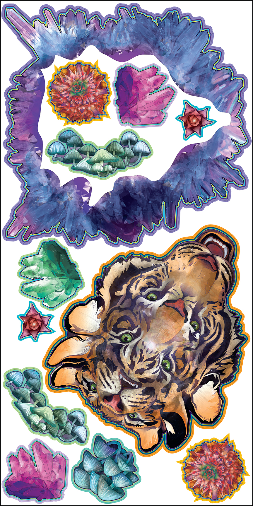
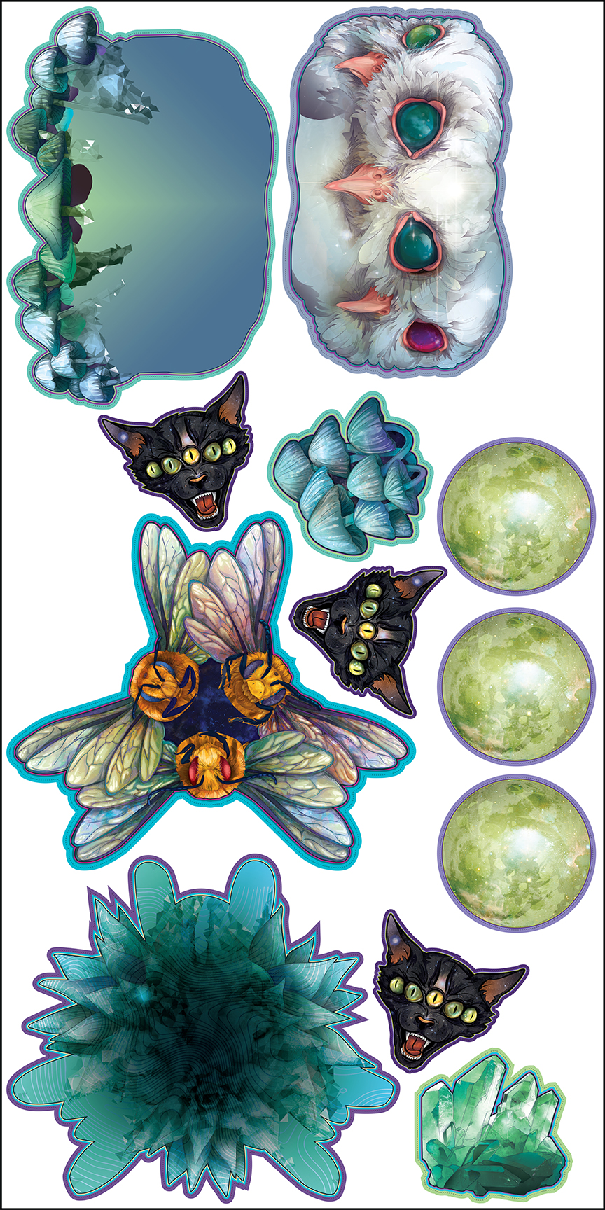
Nested:
Enough of that nerdy color nonsense! Here’s a look at my final nested 4′ x 8′ sheets – as you can see, I had a bit of spare room and made a few duplicates of the smaller pieces [i.e. the crystal cluster, mushroom cluster, and pineapple top]. I also had enough space to add a few MoonCat Mini prints. If you recall, MoonCat was one of my aesthetic inspirations for this new series of work, so it only seemed natural to print a few more. These MoonCat Minis will be available for purchase on my new website (more on that later).
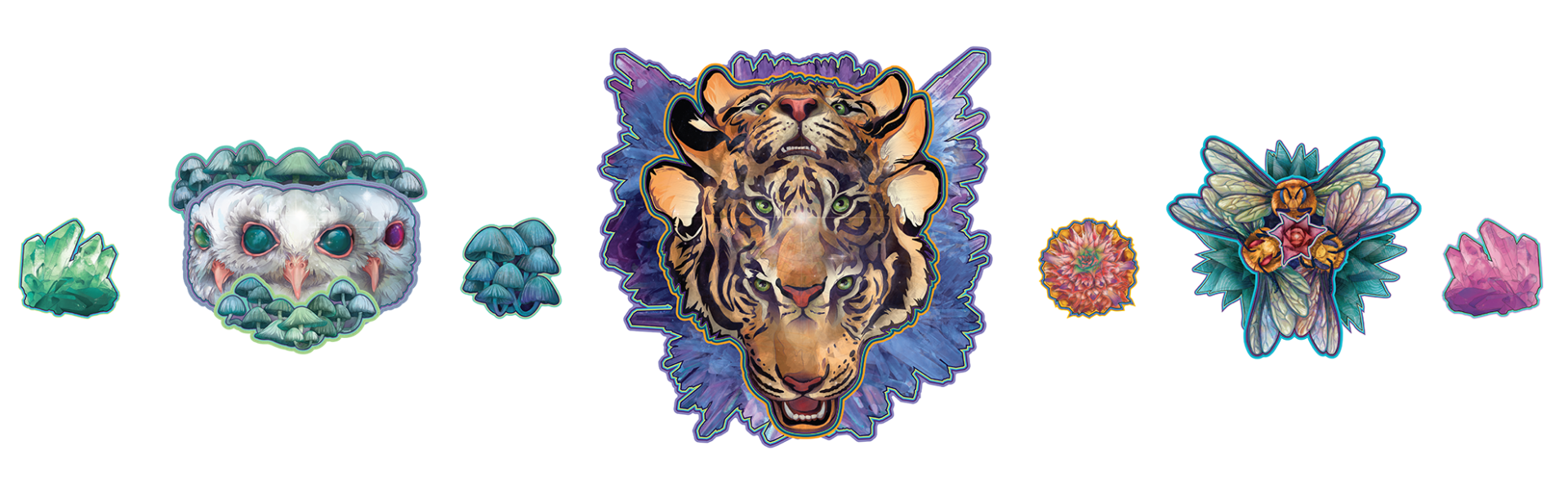
First Looks:
Ladies and Gents, it’s the moment you’ve all been waiting for. Here’s a Display Mock-Up of my pieces for the Creative Pinellas 2019 Emerging Artists Exhibit:
Back to Branding:
In this two-week interim while my pieces are off to print, I’ll be focusing back on creating a new Brand Identity for myself. That means designing a new logo, as well as a new style guide for future branding opportunities. Style guides typically include color swatches, type settings, logos and other brand icons/elements, as well as patterns – all of which can be used to represent a concise and cohesive personality.
I’m looking forward to revealing my new brand strategy with you all in my next blog post, so stay tuned!
Thanks for reading,
-LS
On my mind:
-
- What’s on my Bucket List [I’m gonna make this happen]:
The Illustration Academy - What I’m listening to [like every other metalhead on the internet]:
Spotify – Tool [the entire discography]
- What’s on my Bucket List [I’m gonna make this happen]: