Composition
I’ve said a couple things about composition in the past, but I’d like to explore the topic in a bit more depth. I carefully consider each one of my compositions, and I think that adds to the strength of my artwork.
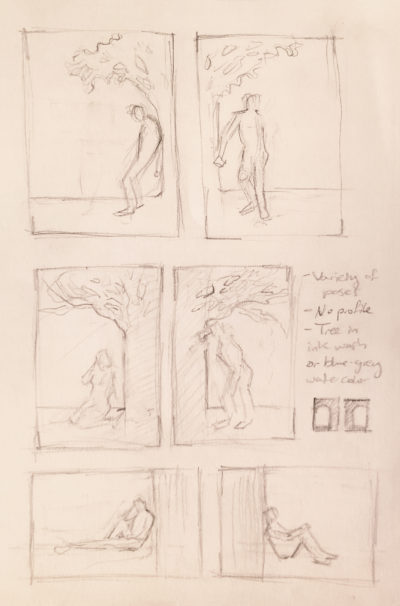
Planning out a composition ahead of time helps you to envision the overall picture and keeps you moving in the right direction. This planning stage can be accomplished in many different ways, such as thumbnail sketches, Photoshop, and gestures. I find that thumbnail sketches work well for me. A thumbnail sketch is a small drawing of what you anticipate your end product to look like. I like to do multiple to see what works the best for the piece. When doing these types of sketches, here’s some things to consider:
- Orientation (horizontal or vertical)
- Size/proportion of work surface
- Placement of important elements
- Scale of elements
- Value (light vs. dark areas)
- Balance
- Line of sight
- Focal point
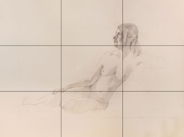
This is no single formula that works, but the rule of thirds is not a bad place to start. The rule of thirds is the idea of creating a 3 x 3 grid on your work surface and lining up important elements at the intersections of these lines. Even if I don’t always follow the rule of thirds, I like to consider it as an option.
Another thing that can help to figure out a good composition is considering artworks that you like and what makes those compositions good. Do you prefer when the subject is centered or off to one side? Do you like paintings that are symmetrical or asymmetrical? Dark palettes or light palettes? This is one of the reasons that art history is such an integral part of a fine art degree. When you are exposed to a lot of different art in different time periods all over the world, you can find out what you like and use that in your own work.
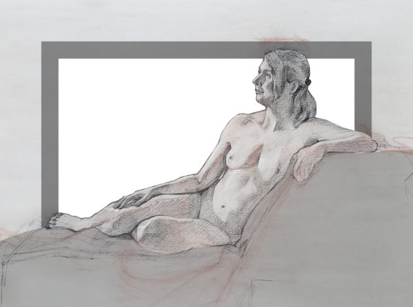
In addition to thumbnail sketches, I also like to plan out my compositions digitally. Photoshop helps me to easily change the scale of elements and move things around until I find out what works best. I can do everything at the scale of my paper and then simply print it out, transfer it, and start working. It’s an easy way around the grid method, which is not a bad method, it’s just a bit more time consuming.
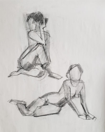
If you prefer to work more spontaneously, a gesture is another good way to plan out a composition. This is how I approach composition when doing a drawing from life. A gesture is a very quick drawing that captures the most basic things about your subject. Think about angles and big shapes, work light and loose. Because this is such a short drawing (1-2 minutes typically), you are less attached to it and can erase and redraw it easily in order to place it how you want. As a figure drawing instructor, I also have my students start with a gesture, because there is nothing worse than spending an hour on a figure drawing and realizing the foot is getting cut off by the edge of the paper.
Artists work in many different ways, but I think most consider composition in one way or another. With your compositional choices, you have control over what the viewer is drawn to in your piece and even what feelings may come about as a result. In this way, composition is crucial to creating meaning in your artwork.
