Through September 24
Free
Morean Arts Center, St Pete
Details here
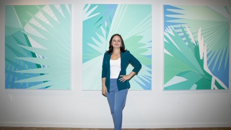
Tropical Splendor, now on view at the Morean Arts Center, is a collection of paintings by Elizabeth Barenis that are both abstract and representational. If you look at them one way, you’ll see a palm frond, but if you look at them another way, they’re swaths of turquoise and repeating patterns.
Their ambiguity is accentuated by their titles, which refer more to emotions than foliage.

Elizabeth Barenis – The titles come from either the impression that I get of the painting when it’s finished, or sometimes I think about what I want the painting to represent before I start.
I know what the subject matter is going to be, I know what it’s going to look like visually, but what’s the meaning behind it? And sometimes I delve into what I’m going through, personally, and I try to have that reflected back to me at the end.

How do you decide the composition for your paintings?
I work from photos. That’s me standing on the corner in your neighborhood taking 30 pictures of a palm tree. Lol!
Once I get the photos, I get back to my computer and sift through all the material looking for interesting patterns of light. It comes down to composition. Sometimes I zoom in closely to find an interesting pattern and sometimes I use the whole picture where it’s less abstract and obviously palm trees but I think it’ll make a good painting.
The colors, however, I pushed in another direction. I pushed the greens and the softness and calming feeling of the turquoise and blue. I wanted a certain feeling from it. For this exhibition, I wanted the color palette to reverberate off of every piece. I created that harmony by using only a few colors and mixing a spectrum of shades from them.
It’s as if I were a musician composing a concerto and choosing to keep each movement in the same “key,” which in this case is blue and green. The red of the hibiscus is an exception to the limited palette and adds a certain flair that accentuates the “splendor” of the show.

Your use of value, with your flat colors, reminds me of the early Disney cartoons where there are no shadows. The simplification of the color palette works well with the simplification of shapes. They’re not three dimensional, but in the vein of abstract expressionism, things recede in space and come forward. There’s an interplay of space by getting rid of value. Like Hans Hofmann and Josef Albers used squares – but you’re using palm fronds.
I’m reducing how many values are there from the original photograph. What you see in them, and what those shapes mean to you, is kind of a reflection of the experiences you’ve had.
I try to put some gradients, though, in all of them — even if it’s just an inch-by-inch portion of the painting — just to remind the viewer that this came from a human hand. I know you can make a gradient in Photoshop, and sometimes people get the impression that it looks digital or they wonder if they’re prints. I think putting in a gradient keeps my human touch in it.

Please explain how you choose your titles, which are very poetic and ambiguous. They seem to describe feelings rather than the depictions of the paintings. For example, one is titled Rest (2024).
Instead of being didactic, what’s interesting is to hear what other people see in it.
For Rest, I developed the design and the colors for it – and before I even started the painting, I thought about what I wanted it to mean to me. At the time, my mother was having some heart procedures done. She had atrial fibrillation at 100 percent, so her heart was constantly working faster than her physical movements. So, this piece is about rest, and wanting to get this woman some rest.
When I finished the painting, I looked for a representation of rest in it, and my mind created a story from the shapes that are there. I see a woman in it who’s wearing a sleep mask and receiving energy from the white light healing her.

Such a personal aspect that’s contextually outside of the work being brought in via the title makes them so much more than they initially seem to be.
What you observe is dependent on the experiences you’ve had. There are these beautiful patterns in nature that you don’t notice until I abstract them enough that you don’t even know they’re from nature. But then it’s clear that these patterns are already present in our world, and if you took the time to see them you could.
And there’s a story to be found. The story is however these shapes connect for you, and reflect back to you and your identity. That’s how we find meaning in the world.

To me, your work is within the canon of Frank Stella and Deborah Kass – you create crisp lines that, at first glance, could be perceived as mechanically made.
I ask myself, ‘Why does it have to be so perfect?’ I’m always correcting tiny, little errors that no one would ever notice.
It comes down to having the painting be as accessible as it can be. If the lines were squiggly, and had human errors in it, and had a little splotch here and a little splotch there, then that creates a focal point that I don’t want to be there. I want the eye to move easily throughout the whole painting.
How do you determine which areas are flat and which are more rendered?
It’s an intuitive decision. If I want every inch to be intriguing, then I will paint patterns in the background.
But for this exhibition, the feeling I wanted to create in this space was one with more breathing room. That’s why I made the backgrounds for some of them completely flat. It creates more space. You can breathe.
That reminds me of the use of white skies in the movie Yellow Submarine – the flat colors in your paintings seem to be for the purpose of visual resting space.
See? Rest.