My Favorite Materials
I’ve experimented with many different art materials and found my favorites. I use different materials depending on whether I’m drawing from life or creating a finished work. Hopefully, this information will provide some insight into my artistic process and help any prospective artists out there!
For Life Drawing
When I work from live models, I draw in an 18” x 24” newsprint sketchpad. Newsprint is a very humble paper, but I love working on it because of both the texture and tone. It is very smooth, so I can draw, erase, and move charcoal around easily. I like the light gray tone of the paper because it allows my white chalk highlights to really stand out from the paper. This is one of my absolute favorite parts of drawing and I save it for the very end. Adding the white highlights really brings life to the figure.
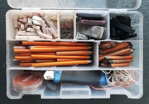
I also bring my box of supplies which has different compartments for my different materials. Charcoal pencils, chalk pastels, charcoal sticks, erasers, a utility blade, and string are my essentials. I like to work with charcoal because I can create a wide range of values. The charcoal sticks allow me to cover a large area whereas I can achieve fine details with the charcoal pencils. I like the chalk pastels because they are very soft. I use a neutral color, such as dusty rose, for drawing an initial gesture to place the figure on the page. I use white exclusively for the highlights. The utility blade is used for sharpening the charcoal pencils, and the string is used for establishing proportions. Using the string is similar to holding a pencil in front of you or using a viewfinder with guidelines, but I find the string much more versatile. When I teach my figure drawing class at the Dunedin Fine Art Center, I provide all my students with string, as proportion is an essential part of my teaching.
For Finished Work
I consider my life drawings to be studies for my finished work. My finished work is a lot more refined, and I take a lot of care in coming up with a composition and getting everything just right in order to reflect my vision. My favorite paper to work on for this type of work is BFK Rives Gray Printmaking paper. Like newsprint, the gray tone of this paper is great for adding white chalk pastel highlights. Additionally, this paper has a bit of texture and weight and I like the feel of it. Because of the texture, I typically use harder weights of charcoal pencils, whereas I use softer charcoal pencils in my newsprint pad. I am very careful when I’m using my eraser on this type of paper, as erasing too much in a single area can damage the paper. I’ve found that a kneaded eraser is a much gentler way to erase. This is also why it pays to plan out my composition ahead of time.
In addition to using charcoal and chalk in my finished work, I also like to use wet media like watercolor or ink wash. Luckily, the BFK Rives Gray Printmaking paper can take these materials fairly well. I have even used acrylic paint on this paper with success. There can be some slight buckling of the paper when wet media is added, but this can be fixed by getting the drawing dry-mounted before framing.
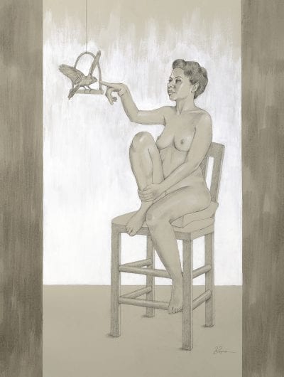
22″ x 30″
Chalk, charcoal, acrylic paint, and ink wash on gray paper
