Week 18
What Pushes Your Button?
Mine is pushed regularly by the work of three artists, in particular, whom I always go back to: Agnes Martin, referenced in an earlier blog, Richard Artschwager and Fred Sandback. All three are considered Minimalists (though Martin considered herself an expressionist). Artschwager’s work also encompassed Pop and Conceptual genres, and Sandback was known for his conceptual work. What interests me most about Martin and Sandback is their use of line; what interests me most about Sandback and Artschwager is how they manipulated space.
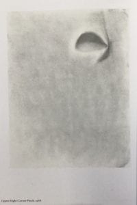
To support his family, Artschwager created contemporary fine furniture. And it is often furniture,  typically chairs and tables, which he then reinterpreted conceptually in his art practice, with an added Pop influence. While that particular work certainly resonates with me, given my interest in chairs, it is his drawings that intrigued me initially. There is a wonderful series in which he creates his forms from outside in or inside out. In other words, his forms and figures are shaped not with line but with shading of the space. His manipulation of space becomes as substantive as the form of the subject matter.
Sandback’s use of space is equally as tangible as Artschwager’s. Using yarn or cord, Sandback delineated three-dimensional space in such a way as to create a concrete sense of volume. It is an uncanny sensation to walk into a gallery that has lengths of cord strung at different angles and feeling as though one has walked through a door or peered through a window into another space, a space that doesn’t actually exist (see the link below to images of his work).
How a line is drawn can evoke a whole variety of feelings all on its own, of course. How it is used to define space, however, adds a whole other element. And it is this that fascinates me so – how the combination directly affects both our sense of perception and how we physically feel in that perceived space. Line, after all, is just line, whether visual or implied, and space is simply empty. Put the two together, however, and poof, magic happens.
It reminds me of an early lesson I learned while studying fashion illustration in college. That is, that one does not need to provide all the information in a drawing (or any other medium), only just enough for the mind’s eye of the viewer to automatically fill it in, often without the viewer ever realizing anything is missing. It is the thoughtful and judicious use of line and how it intersects space that sets the stage for perception.
There is nothing new in all this, of course, it’s all part of the play book that artists work with along with all the other elements and principles. But I will hazard a guess that every artist has a particular button which, when pushed, makes them break out and dance. Implied or otherwise, line and its partner, space, is mine.
Thanks for reading!
Lynn
NOTE:
Fred Sandback’s sculpture can be viewed at https://www.google.com/imgres?imgurl=https://d1jrllzqbjb41.cloudfront.net/uploads/attachment/image/body/3395/sanb740002_2WEBEDIT.jpg&imgrefurl=https://www.lissongallery.com/artists/fred-sandback&tbnid=T1nOiBwqwyVf3M&vet=1&docid=grbn6PCuxshSOM&w=1000&h=1333&q=fred+sandback+sculpture&source=sh/x/im


